
Not in this case however. Today's crap fantasy cover is from Across the Face of the World, by Russell Kirkpatrick. I've not read the novel, but I understand it to be fairly traditional in its premise (young companions on quest, dark lord rising and all that). The publishers clearly wanted to create an epic feel with the cover, and rightly so. The result was very nice indeed:

Mmmm. Waterfalls, mountains, forests and creaky rope bridges that make you wish you hadn't eaten that extra pie for breakfast. The cover has the desired effect; you look at it and think "Ah, this is going to be a big adventure." Unfortunately, the same can't really be said of the UK cover:
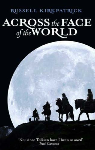
Hmmm. The effect just isn't the same, is it? Instead of rivers and waterfalls we have a moon. A HUGE moon. And some horseriders. And that's it. It's almost trying to recreate one of the covers for Robert Jordan's The Eye of the World, and failing rather miserably. Perhaps they should have changed the title to 'Across the Face of the Moon' instead. It's not a terrible cover by any means, but it's just rather uninspiring, especially compared to the US version. Come to think of it, why couldn't they just have used the same cover? Slapped wrists all around.
Crap-o-meter rating: 7/10


2 comments:
But the Robert Jordan covers were worse.
I have to admit I kind of like them...reminds me of being 15. :)
Post a Comment