
James Barclay's Raven novels, not so long ago, were re-issued with a selection of highly impressive covers; a mix of silhouette with bold, single colours. In short, they looked damned cool. See, for example, the cover of Demonstorm:
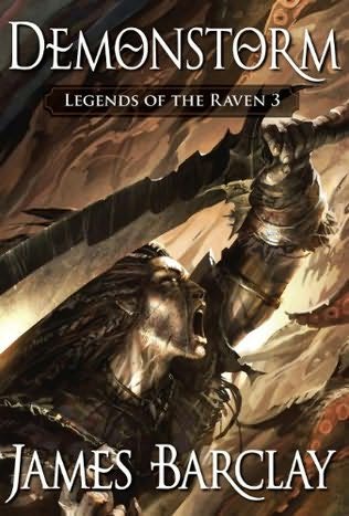 Nice, isn't it? It's bold and quite sophisticated. More than that, it's mature. Businessmen commuting to work in the morning wouldn't be afraid to read it on the tube. It kind of says "Yeah, I read fantasy and I, like this book cover, am cool."
Which is less than can be said for the covers of the earlier editions of Barclay's novels. Take, as a sample, the cover for Noonshade:
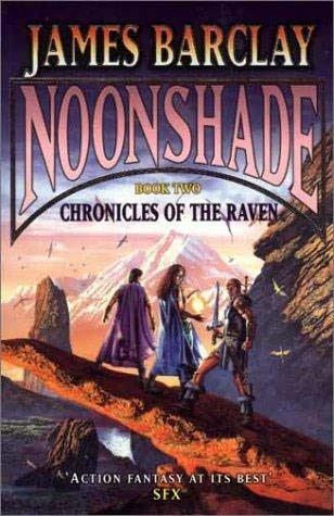 Yes, Noonshade - like all Raven novels - involves liberal use of magic. There are also plenty of battles and adventure. Yet this doesn't mean the novel should have been degraded with this sub-dungeons and dragons cliched imagery that is both hilariously dated and woeful in equal measure. I mean, this looks like a novel that was published in the seventies or eighties, right? Actually, it was published in 2000. Yes, that's right. 2000. So why the publisher used such an eighties genre relic like this picture is anyone's guess.
It's all just so awful; the 'dramatic' pose, the 'epic' vista and the 'adventuring party' combining warrior and mages... It looks like something out of He-Man. If I could have found a decent-sized picture for the original cover of Dawnthief, I would have shown that also. It's even worse.
Let me just make it clear that I really like D&D and owe it for my love of fantasy. Yet much of the associated artwork I'm not so keen on, and that also goes for some artwork influenced by D&D. Such as this piece.
What's depressing about it is that it's this kind of artwork that causes the mainstream to regard fantasy readers as snivelling morons.
In a single word: dire.
Crap-o-meter rating: 9/10


6 comments:
Geez, you are one of the busiest bloggers I know. I've been in NYC all week so I'm a little behind on the entries.
At first when the page loaded I thought you were saying that the silhouette cover was crap and my mind instantly went into revolt mode. Then I saw that you said it was a re-release and it was phenomenal, which I agree with wholeheartedly.
The original cover I agree with you on, too. I probably could have hurked up a better cover (if you'll pardon the analogy). Who do they get to paint these monstrosities??? I wonder if the author had to sit next to a big cardboard cover and feel sheepish during signings... and while people took pictures.
Seriously, no wonder people are embarrassed.
Hey TD. Hope you had a productive week in the Big Apple...
I was debating whether to include the new cover, as I suspected that people glancing over the post might think I was slating it, which is obviously not the case. I think the current covers are superb.
As for the old cover, God knows what they were thinking. Perhaps they were trying to aim the novels at the D&D crowd. Either way, it doesn't stop the cover from being complete crap.
By the way, I've actually re-written the post since you left your comment, so you might like to have a re-read!
Well, I'm glad you all like the new covers. I thought it was a brave and smart move and so it has proved.
As for the old style, well, they may be outdated now but even in 1999 when Dawnthief came out with its 'big blokes with swords' cover, this style was still in vogue. And it worked too. Sold many a book and that is what a cover is there to do.
For the record, I loved the cover of Dawnthief. It was my first and will always hold a special place for me (I bought the original painting too). But I felt the subsequent covers didn't live up to it at all.
I did not look sheepish during signings :). Always proud and flattered that anyone should want to come and see me whatever the state of the cover.
BTW, with Ravensoul coming in August 2008, the whole series is going to be rejacketed. Watch this space.
I saw Barclay's books when I was in Toronto recently and practically drooled over all of the silhouette covers. They're just so stylish that it hurts. My wife, however, was a bit unimpressed (but she never reads fantasy so no big surprise there). Unfortunately I didn't pick up any of them because I didn't quite know where to start.
I did, however, buy the UK version of the Lies of Locke Lamora (which I am LOVING, btw). This blog has been so healthy for my reading list.
James: Cheers for dropping by! Great to have you here. Sure, I understand why the covers were chosen (although I am slightly surprised that sort of style was still popular in 2000). Then again, it was 8 years ago. Look forward very much to seeing the new covers and new novel!
TD: If you want to check out the Raven novels, then start with Dawnthief which is the first one. While a decent read however, it's not as good as the later books. I found that Noonshade (the second book) was a big improvement. I've only read the first three Raven novels, and they're good fun. Worth checking out.
Yet again the American fantasy market fails me. I checked two bookstore chains on Sunday and could not even find the non-cool cover version of Dawnthief because it is "out of print". I'll have to load up on books the next time I'm in Canada.
BTW, the UK cover of Lies of Locke Lamora is far superior to the US one. Finished it over the weekend as well but I couldn't quite understand why there's more than one book, especially since the cast got significantly axed. The first half of the book had me enthralled, though.
Post a Comment