 Happy New Year to everyone! I wish you all a prosperous 2010.
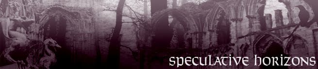
Unless this is your first time visiting, you'll have noticed the new banner and colour scheme. While I liked the old banner and the green and black scheme, I felt it was getting a little tired and was in need of freshening up. I thought I'd go for something totally different in terms of colours, though the actual layout and template hasn't changed.
I'm pleased with the end result, and especially delighted with the banner which was designed by my brother Jelly. Despite being madly busy with his own art projects (not to mention being totally inexperienced with this sort of gig), he put in a heroic effort in his spare time to create this awesome banner, and I owe him many thanks. Cheers Jelly!
Anyway, I do hope you all like the new-look blog and continue to visit in what promises to be a great year for the genre.
Here's to a genre-tastic 2010!


26 comments:
That's a very pretty banner.
And I prefer the lighter background; my eyes never liked the black one. ;)
Happy New Year.
Love the new look! Your brother did an awesome job with the banner.
Wow! That is definiteley a big change!
I was totally suprised when I opened your blog and there was no black background.
Do I like the new banner and the new look?
YES.
The banner is well done and the rest of the layout is real eye friendly.
HAPPY NEW YEAR
Thanks guys, I'm glad you all like the new look and the banner. I agree that while the black and green colour scheme was striking, it wasn't the most eye-friendly scheme around! I did eventually come to realise that the white text on dark background did grate after a while, so wanted to to change that - glad the new look seems to have done the trick.
Happy New Year to you all!
Not yet a new decade. There is no Year Zero; time reckoning starts at 1, so it's 1-10, not 0-9, and thus you're a year premature.
Yes, you hit this historian's big pet peeve (as these errors do mess up archives far too much as it is).
The banner is awesome, congratulate the skilled artist. :) And yes I will still pop up here and even comment more. It's one of my resolutions, try and get more involved with the people that make the web the interesting place that it is.
All the best in 2010
Bradford - I must admit I care little for academic conventions. As far as I'm concerned we're in the 10's rather than the 00's, so it's a new decade to me!
Harry - cool, glad you like it. Look forward to seeing you around!
Ah, I have always been around, just lurking like a stalker *ninja*
I hope you also pop a few times in January and see how the Comic Book Month is progressing and input an opinion. It will be my first themed month and I am looking forward to all points of view to get the most out of it as a host.
Way to go James, love the new look!
Great redesign! It's more ... mysterious and ominous, more ... Gothic.
Like Harry Markov, I lurk about here frequently. Congrats on a very fine year for your blog -- and thanks, in particular, for your recent post on your tips for blogging and reviewing.
Happy New Year.
Loving the new look! Much easier to read! Now all you need to do is actually have a full RSS and I'd be a happy camper!!
Happy New Year fella! I hope I jump into you again in 2010!
That's bump into you again! No jumping I promise!
I like the new look. Very relaxing and cool.
Staggering. I think my eyes will be thankful. And the banner looks great.
Happy New Year James.
Excellent revamp and excellent banner. Keep up the good work in 2010.
The banner is fantastic, although I seem to be the only one that liked the black background. Great new look nonetheless.
I like the new look a lot - the white text on black was hard to read, so this is much better on the eyes.
There was nothing wrong with the old look, but I really like this too.
It's good advice to never get complacent. Looking forward to reading your thoughts in 2010.
Loving the new design! Much more eye friendly ;) Happy New Year, James!
Many thanks to you all for the positive comments - I'm really pleased the new look has met with approval.
Even though this is my first comment, I've been visiting your blog since months ago because I really like your posts. And I also like fantasy. Keep on!
I also like the new look!
Happy New Year!
Szilvia from Hungary
Love your blog--the new banner's way cool--black on light grey is so much easier to read than the old color scheme. (I admit, I read mostly via RSS, where I sidestep a lot of odd color and font choices out there in blogland.)
(It both (a) is not a new decade, and (b) is the '10s--so you're half right. ;-) (/snark)
Thought something was wrong with my browser when I came here. :P Your brother did a great job with the banner and the colours work nicely.
Again, thanks for the positive comments - I agree that it's much easier to read.
And I don't care what the naysayers say, I consider it to be a new century! ;-)
I like the new look James!
Cheers Rob! You're not alone. :)
Post a Comment