Showing posts with label Crap fantasy book covers. Show all posts

Tuesday, 23 February 2010

Crap fantasy book covers #20

It's been a while since we last abused our eyes by gazing upon a crap fantasy book cover, but never fear - here's a particularly terrible cover that is more than worthy of being the 20th cover to be selected for this particular feature.

Behold, an old cover for Terry Brook's The Black Unicorn.


I always thought unicorns were meant to be graceful, beautiful creatures with a mystical aura about them. A bit like, say, this. Yet this one looks more like an angry goat. Perhaps he's pissed because his handler has just turned into an ice sculpture whilst pointing at the craptacular rainbow in the background.

Whatever, it's a horrendous cover.

Crap-o-meter rating: 9/10

Friday, 20 November 2009

Crap fantasy book covers #19

I realised that it had been far too long since I've run a crap fantasy book cover feature - the last one was way back in April. So apologies to all you sadists out there that like nothing more than vomiting over horrendous covers - and I know there's a few of you! ;-)

So anyway, check out the Danish cover for Guy Gavriel Kay's second Fionavar novel.

Now, admittedly I've never read this book but I doubt it includes pink dinosaurs...does it? I also like the fact that you can't see the rider's saddle, so it looks like he's just randomly stuck on the dino's back. Plus the scale is all over the place - the figures in the background look to be too small. To round it off, either they're standing on a river of blood or the grass in Kay's world is red...

Utterly bizzarre.

Friday, 3 April 2009

Crap fantasy book covers #18

Believe it or not, this cover is so vomit-tastic that Graeme actually refused to post it on his blog. Fortunately, I have a strong stomach (and plenty of sickbags) so decided to take the risk.

Can't blame Graeme though. Just staring at this cover makes my stomach churn. I can practically feel my eyeballs melting. I wouldn't be surprised if the publisher receives a flood of compensation claims from enraged readers over loss of vision, after their eyeballs rebelled and imploded from being forced to gaze upon its sheer crapness.

I'll be honest - I find it hard to take urban fantasy seriously anyway, but it's even harder when the genre's novels have covers like this.

Whatever you do, don't laugh at the woman on the cover - she's Death's daughter. No, seriously. Aside from the title, you can tell by the secksy skull pendant she's wearing and by her laughably bad surname: Reaper-Jones (you at the back, I said no laughing!)

What the hell that cute dog in the ridiculous collar is doing is anyone's guess. For a laugh, I was actually going to post the blurb, but it's even worse than the cover.

Crap-o-meter rating: 9.5/10

Friday, 6 March 2009

Crap fantasy book covers #17

I was planning on just doing some linkies (see previous entry), but then I saw this dreadful cover and almost spewed up my lunch all over my desk.

It's difficult to determine what the worst aspect of this cover is.

Perhaps it's the bowl/mullet haircut sported by the protagonist, last seen adorning the head of He-Man, back in the 1980s.

Or maybe it's the fact that he's got his groin thrust out.

Then again, you could make a case for the exterior background. What's up with those squashed towers?

Seriously though, this sort of bland, generic cover really irks me. Fantasy gets a bad enough press a lot of the time, so why do we kick ourselves in the balls by having crap like this on the covers of our books? Sure, I get it - it's commercial. It sells books (for some reason). But can't we have something a little more sophisticated than some dandy staring lovingly at a sword in front of a poorly-realised background?

Crap-o-meter rating: 8.5/10

Wednesday, 4 February 2009

Crap fantasy book covers #16

Not for one minute did I ever expect a Joe Abercrombie book cover to feature in one of these posts. Joe's first three novels have excellent covers that were widely praised. Indeed, the UK artwork for his new novel, Best Served Cold, had many of us drooling like a beggar in a bakery. Here it is, in case you've somehow not seen it yet:

Mmm, nice....very nice. The above cover is in-keeping with the style of the covers for the First Law trilogy, but adds a new dimension with the map and sword. All things considered, it's very cool indeed. So it's a huge shame for our American friends that Orbit US thought, "Hmm, not sure whether this is suitable for the market over here. It's missing something. What if we just did this..."


"Result! Secksy chick in leather and wider market appeal 4tw!"

Well, no. Not really. Sure, I understand the reasoning. Urban fantasy is huge right now, so slapping an image that has more in common with a story about some emotionally unstable, leather-clad heroine (who is the offspring of a demon and a werewolf, and is currently dating a vampire in the spare time she has inbetween 'assignments') does make some sort of skewed sense.

But not when you slap it on one side of the cover, leaving half of the original artwork on the other side. The result is a clumsy fusion of two elements that looks about as comfortable as a sober Amy Winehouse. They just don't match. The idea is clearly to try and get Abercrombie's novel to a wider audience, but I can imagine both urban and epic fantasy fans looking at the cover and thinking, "Er, no."

Still, only time will tell as to the success of this cover. I've little doubt that the novel hiding behind that terrible cover will be vastly superior in terms of quality. While we're on the subject, be sure to check out Aidan's article in which he examines Orbit's response to the online uproar (and which includes some of the other covers that were considered).

Crap-o-meter rating: 8/10

Sunday, 30 November 2008

Crap fantasy book covers #15

This is the third time the artwork of Darrell K. Sweet has appeared in 'Crap fantasy book covers' and it's certainly not third time lucky. In fact, this is probably the worst cover of the three, even blander than Lord of Chaos and Natural Ordermage (you at the back, stop sniggering at that book title!). 

Cover your eyes...

I don't even feel the need to say why this cover is crap, as it's self-evident. Fortunately, Wert - in his recent review of Knife of Dreams - has done so for us, suggesting that the cover is "possibly one of the worst fantasy covers in history" and "not Darrell K. Sweet's finest hour."

You won't get any disagreement from me.

Crap-o-meter rating: 9/10 

Sunday, 16 November 2008

Crap fantasy book covers #14

I stumbled across this rather horrific cover courtesy of Graeme's review. 

Graeme clearly found himself unable to review the book without first mentioning the cover: 

"Cover art is a funny thing isn’t it? It’s such an important part of the book as it’s the first thing you notice in the bookstore and could potentially put someone off buying the book itself. Everyone has different tastes though and this must make it difficult for a publisher to come up with cover art that will appeal to plenty of people... On this occasion, the cover art for ‘The Queen of Stone’ really didn’t work for me..."

It doesn't work for me either. No wonder people look down of fantasy when you have this sort of appalling cover on display. Those unfamiliar with the genre, after seeing this cover, could be forgiven for thinking that all fantasy fans are sexually-frustrated, pimple-faced loners. 

This is dumbed-down fantasy art at its best. Sure, maybe it represents the actual book accurately (Graeme's review seems to confirm this) but it's still a totally crap cover.

Crap-o-meter rating: 9/10

Wednesday, 5 November 2008

Crap fantasy book covers #13

Saw this artwork posted over at the hotlist as part of Pat's interview with Tom Lloyd, and immediately I knew it would have to feature here as a crap fantasy book cover.

It's just...I don't know. Tired. A bland image - some generic dragon throwing a frilly-cuffed strop, with Iron Man (wtf is he doing there?) holding a couple of those cheap plasma balls you can get from all tacky novelty shops.

What interested me though, was Lloyd's response to whether he liked the artwork:

"I’m very happy with both the covers he’s done; I think they’re perfect for the market and just great images in themselves."

Disagree with the last point, but Lloyd's probably bang on the money with the first - and that is perhaps why although this cover is awful, it might be suitable. The difference between the US and UK markets has been mentioned time and time again.

Still, however suitable the cover is, it's still crap.

Crap-o-meter rating: 8.5/10

Wednesday, 20 August 2008

Crap fantasy book covers #12

I'm not sure whether August's just been a slow month, or whether I'm subconsciously feeding some perverted crap fantasy book cover addiction, but either way I seem to have found myself gazing - dumbstruck - most of the time at crap fantasy covers. 

They just keep on coming...and keep getting worse. 

Look at this one. The young lady in the middle isn't so bad (if you ignore her hairstyle, which resembles a dollop of shit) but any chance the cover had of actually being anywhere approaching decent is ruined by the figures on either side of her. I mean - if you're going to have characters on the cover, make them look cool for heaven's sake. 

But no. Instead, we have Rumpelstiltskin on the right, sporting a woeful pudding bowl haircut. On the left, we have the result of what happens when you crossbreed an Ewok with Bungle from Rainbow. 

The only figure that looks ok is the bird, which you can't see anyway because someone thought it would be a great idea to put the author's name over it. Still, it would have made little difference - you can't polish a turd, after all. 

Crap-o-meter rating: 8.5/10

Thursday, 14 August 2008

Crap fantasy book covers #11

Just when you thought it was safe to emerge from cover after yesterday's crap-tastic Russian cover...

This one is also Russian - I sense a theme developing here - and unbelievably it's even worse than the last one. This particular sample is apparently the cover for Erikson's Deadhouse Gates.

Words fail me, really. I suppose the one redeeming feature is the fact that I think it does depict characters/events from the novel. Other than that, it's pretty horrendous. The way they've dumped a small background template on top of another is odd (not to mention the fact that it doesn't really work) but by far the worst aspect is the pantomime villain with the impressive hat and total lack of fashion sense.

Seriously, what was wrong with just using the UK and US cover?

Crap-o-meter rating: 9/10

Wednesday, 13 August 2008

Crap fantasy book covers #10

Oh dear.

Came across this shocker on the Westeros forums. Apparently, it's the Russian cover for The Lies of Locke Lamora.

If I'm right in thinking that the people that appear on the cover are characters from the books, then Jean Tannen seems to have been turned into a monk, swapped his knives for a pathetic-looking axe and obtained a swish golden mask from somewhere (for no obvious reason). He's also wielding some sort of crap, magic Orb of Doom or something.

The Berangias sister that's standing also appears to have had a sex change.

Now, I know that different markets require different marketing and so on, but that doesn't seem to be justification for putting a crap cover like this. Boo!

Crap-o-meter rating: 8/10

Wednesday, 23 July 2008

Crap fantasy book covers # 9

I wasn't sure whether it was a good idea to have a look at yet another crap fantasy cover so soon after the last one - there's only so much you can take before your eyeballs melt, after all - but I thought I'd risk it.

There's only one redeeming feature that this cover possesses and that's the nice sky in the background. Mmm, pinky and orangey clouds. Nice.

The rest is pretty dire. Not sure who the chap in the centre is (Rand? I'm sure someone can correct me) but he's got crap fashion sense. The shirt is about three sizes too big for him AND he's tucked it into his trousers, which are clearly too small. Clearly, finding a decent tailor in Jordan's world is pretty difficult.

Then there's someone - a young boy? A young girl? An Aes Sedai? - who is clearly freaked out by the distinctly nonthreatening bat creature in the top right corner.

The whole thing is just totally dull. I kind of wonder what sort of discussion the publishers had regarding this cover. Perhaps it went something like this:

Publisher A: "Ok guys, any ideas for cover art for book seven of Jordan's series?
Publisher B: "Book six."
Publisher A: "Damn, you're right. Book six then. Any ideas?"
Publisher C: "Uh, I'm not sure. What about one of those things...what are they called? A trollop?"
Publisher B: "No, a trolloc. Hmm, I'm not sure whether that's a great idea..."
Publisher C: "Um...well, maybe we should base it on a pivotal event from the novel."
Publisher B: "Yeah, good idea. So...what does happen in the novel?"
Publisher A: "Nothing."
Publishers B + C: "Oh."
Publisher A: "Sod it, I'm bored now. How about some bloke in an over-sized shirt and tight trousers with a boy/girl freaking out over a harmless-looking bat?"
Publisher B: "Great idea! Now, where are the donuts?"

Well, it might have been something like that.

Crap-o-meter rating: 8/10.

Monday, 21 July 2008

Crap fantasy book covers # 8

Saw this book cover recently and immediately thought it was another entry on the crap fantasy book covers list.

On first inspection you might think that this cover is not half as bad as previous ones I've featured, and to some extent that is true. But if you consider this cover in more depth, it becomes apparent just how crap it really is.

The worst thing about it is that it looks so dated, like its come straight out of the 80s. Intrepid adventurers riding boldly towards an ominous tower...it's just dull. Nothing about this cover excites me, or makes me want to read the book (thought admittedly it's not helped by the novel's boring title either).

Given the standard nature of the book's storyline (magical daggers, dragons, good vs evil, etc) perhaps such a bland cover is no surprise. After all, the book is clearly aimed at those readers that enjoy more 'traditional' fantasy, so it makes sense to have a cover showing the heroes and their destination.

The thing is, surely it's not difficult to - if you're going to have a cover like this - at least do it with a bit of style. Look at what Solaris did for Gail Z. Martin's books - they feature the most standard fantasy characters (a wizard and a king) and yet they're done extremely well. The above cover however is just half-arsed.

Perhaps the publisher ought to take a leaf out of Solaris's book...or better, look at their covers and see how it should be done.

Crap-o-meter rating: 7.5/10

Saturday, 7 June 2008

Crap fantasy book covers # 7

Gather around friends, as it's time again to delve into the craptastic world of rubbish fantasy art.

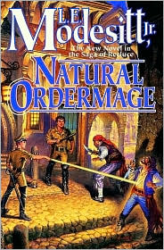
The crap fantasy cover featured this time is L. E. Modesitt's 'Natural Ordermage' (perhaps I ought to do a crap fantasy book title feature as well - that would be right up there).

The scene depicted on this cover is pretty amusing. In the centre we've got Action Man, striking a ridiculous pose with a truncheon. To the left there's some sort of military dominatrix, whose middle finger is evidently suffering from Pinocchio syndrome. Then there's the two comedy thief-types, the first of whom looks like he's trying to take a shit. The other one is no doubt groaning in ecstasy from being tickled by said dominatrix's overgrown finger.

The posture of the characters is terrible, and the apparent magic that is meant to be bursting forth from said dominatrix is about as exciting as the thought of getting up and going to work in the morning.

Rubbish.

Crap-o-meter rating: 8/10

Friday, 21 March 2008

Crap fantasy book covers # 6

Ladies and Gentlemen, it's time for yet another trip into the horrific, sordid world of crap fantasy book covers. Prepare the sick bags. Onwards!

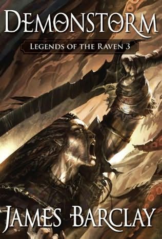
James Barclay's Raven novels, not so long ago, were re-issued with a selection of highly impressive covers; a mix of silhouette with bold, single colours. In short, they looked damned cool. See, for example, the cover of Demonstorm:


Nice, isn't it? It's bold and quite sophisticated. More than that, it's mature. Businessmen commuting to work in the morning wouldn't be afraid to read it on the tube. It kind of says "Yeah, I read fantasy and I, like this book cover, am cool."

Which is less than can be said for the covers of the earlier editions of Barclay's novels. Take, as a sample, the cover for Noonshade:

Yes, Noonshade - like all Raven novels - involves liberal use of magic. There are also plenty of battles and adventure. Yet this doesn't mean the novel should have been degraded with this sub-dungeons and dragons cliched imagery that is both hilariously dated and woeful in equal measure. I mean, this looks like a novel that was published in the seventies or eighties, right? Actually, it was published in 2000. Yes, that's right. 2000. So why the publisher used such an eighties genre relic like this picture is anyone's guess.

It's all just so awful; the 'dramatic' pose, the 'epic' vista and the 'adventuring party' combining warrior and mages... It looks like something out of He-Man. If I could have found a decent-sized picture for the original cover of Dawnthief, I would have shown that also. It's even worse.

Let me just make it clear that I really like D&D and owe it for my love of fantasy. Yet much of the associated artwork I'm not so keen on, and that also goes for some artwork influenced by D&D. Such as this piece.

What's depressing about it is that it's this kind of artwork that causes the mainstream to regard fantasy readers as snivelling morons.

In a single word: dire.

Crap-o-meter rating: 9/10


Monday, 25 February 2008

Crap fantasy book covers #5

Yes, boys and girls, it's time to delve once more into the murky world of crap fantasy book covers. Today I thought I'd look at one which I actually saw in Waterstones earlier on today: Fallow Blade, by Cecilia Dart-Thornton, book four of the Crowthistle Chronicles.

Now, I actually like the artwork for the other books in this series. I like the colour tones and the borders, with all the little critters around the edges.

But the artwork for Fallow Blade is a bit rubbish. Five words: horses with bright green manes. What is otherwise a decent picture is ruined by the ludicrous colour of their manes. Look at the tones of the other colours: earthy, moody, natural. Then look at the colour of the manes: luminous, almost neon-like. In short, they stick out like a sore thumb.

I think I know where this misguided inspiration came from:

Yes, My Little Pony. Shock. Horror. But's it's true. Look at the pony on the right. It's the spitting image of the horse on the front of Fallow Blade. It's like My Little Pony versus the evil goblinoids.

Shame! Such blatant plagiarism! Shame on you, Mr Artist Sir!

Crap-o-meter rating - 6/10

Sunday, 17 February 2008

Crap fantasy book covers #4

I don't normally agree with anything Terry Goodkind says. It's difficult to agree with someone who said that gang-rape is "democracy in action." I'm not sure Plato would agree, Terry. I certainly don't. I could go on at great length about how much I disagree with the holier-than-thou words of Goodkind, but perhaps I'll save that for another day. Or until his next interview, which no doubt will throw up a few new gems.
But, back to the point. Goodkind said something the other day that I actually agreed with: that some of his book covers were shit. Now, he probably thinks this because they are too 'fantasy' for him (Goodkind doesn't write fantasy, you see. He writes literature. Apparently). Well, whatever his reasons I can at least see where he is coming from. Check out this one, from his third novel Blood of the Fold:


Not great is it? A dragon clinging to a pillar. A bloke - Richard Rahl, one presumes - wearing some hideous yellow shirt his uncle gave him for Christmas. Some stripper in red bondage gear complete with eighties femme de mullee (that's female mullet, to you and me). And that's about it. Hardly inspiring. Still, at least Goodkind's publisher recognised his work as fantasy, which is more than we can say of Mr Goodkind himself.

Crap-o-meter rating: 8/10

Thursday, 7 February 2008

Crap fantasy book covers #3

Something that has been remarked upon by fantasy readers on internet forums is the difference between UK and US book covers. Presumeably due to the fact that the markets are not quite the same, publishers often feel the need to use a different cover on each side of the Atlantic. For some reason, the UK covers generally seem to be a lot better.

Not in this case however. Today's crap fantasy cover is from Across the Face of the World, by Russell Kirkpatrick. I've not read the novel, but I understand it to be fairly traditional in its premise (young companions on quest, dark lord rising and all that). The publishers clearly wanted to create an epic feel with the cover, and rightly so. The result was very nice indeed:


Mmmm. Waterfalls, mountains, forests and creaky rope bridges that make you wish you hadn't eaten that extra pie for breakfast. The cover has the desired effect; you look at it and think "Ah, this is going to be a big adventure." Unfortunately, the same can't really be said of the UK cover:


Hmmm. The effect just isn't the same, is it? Instead of rivers and waterfalls we have a moon. A HUGE moon. And some horseriders. And that's it. It's almost trying to recreate one of the covers for Robert Jordan's The Eye of the World, and failing rather miserably. Perhaps they should have changed the title to 'Across the Face of the Moon' instead. It's not a terrible cover by any means, but it's just rather uninspiring, especially compared to the US version. Come to think of it, why couldn't they just have used the same cover? Slapped wrists all around.

Crap-o-meter rating: 7/10

Saturday, 2 February 2008

Crap fantasy book covers #2

Time to delve once more into the shadowy realms of laughably bad genre cover art. Today's pick is a personal favourite: Silverthorn by Ray Feist. Here it is in all its glory:


Hideous. I can't think of a better word. What the hell was going through the publisher's mind when this abomination was chosen? You can almost imagine the conversation: "Ok guys, we've got Silverthorn, a story about a group of heroes off on a quest to find a cure for a dying princess, while the machinations of war rumble on in the background. Anyone got any ideas for a cover?" At this point some wayward jobsworth (probably looking and sounding something like Gareth from The Office) raises a hand and says "Er, how about this picture of a big, crap rock with some random twat sitting on a horse in front of it, and a half-arsed city on another rock in the background?" To which the others all respond: "Perfect! Now, where shall we go for lunch?"

No, it's not perfect. It's shit. Look at it. It is one of the most dull pictures I've ever seen. Yet again, we have the nauseating red text which just about tops off what is a truly crap front cover. Even worse, it has nothing to do whatsoever with the book. I can't stress how much I hate it when publishers do this. I firmly believe the cover should be representative of the story within the pages. I can understand why they sometimes do it, if there is a good piece of artwork that fits the purpose, but when it is a poor cover and has nothing to do with the story you just wonder. What is even more staggering is that given the success of Feist's first novel, Magician, you'd think the publisher would have pulled out all the stops with the follow-up. Clearly not.

Shocking, shocking, shocking.

Crap-o-meter rating: 9.5/10

Sunday, 27 January 2008

Crap fantasy book covers #1

Fantasy fiction has been around for a long time. We've seen some great books and some not so great books. The same goes for the covers. I thought it would be fun to take a look at some of the worst fantasy book covers out there. I'm sure everyone knows the old saying "Never judge a book by its cover", but some of these covers are so horrific you'd be forgiven for dropping the book and running out of the bookstore screaming. So without further ado, the cover that has the unfortunate honour of being the first in our little series, is the cover for The Bonehunters by Steven Erikson. Here it is in all its glory:


Look at it. It's horrible. It looks like Santa's sleigh plowing into the side of a mountain with presents spilling everywhere, two of Santa's helpers and four of Gollum's younger brothers all flailing around in disarray. Not just that but the colours just seem too bold as well; the red text for the title borders on being offensive. They should give away free sick bags with this version of the book. The worst thing of all is that Erikson is a fine writer and it must hurt to have this turd of a cover on one of his books. Still, the one redeeming feature is that at least something is happening in the picture. There's far worse than this cover out there...

Crap-o-meter rating: 8/10